Working with Buttons

Beefree App is now RGE Studio!
The email design suite you already know and love just leveled up. We’re working hard to update our help center, but you still may see some references to the old product name.
This article applies to the Email and Pages builder in all plans.
Overview
The button content block adds a clickable button to your email or page. You can customize its appearance and set a destination link. You can also add a hover effect for desktop users.
Add a Button
To add a button to your design:
- Drag the Button block from the content blocks panel onto the stage.
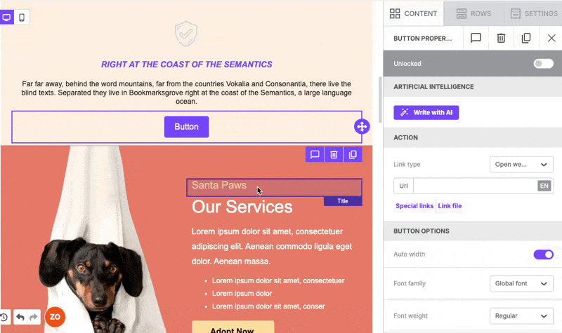
- Click the button on the stage. Button Properties opens in the right panel.
To edit the button text, click it on the stage and type directly. The text toolbar supports basic formatting and merge tags.
Note: Font and color settings are in Button Properties, not in the text toolbar.
Button Properties also includes a Write with AI option to generate button text with AI. This is available on paid plans. Learn more about using AI to create content.
Set a Button Link
Use the Action section in Button Properties to set where the button takes users.
- Open the Link type dropdown and select the link behavior. The default is Open web page.
- Enter the destination in the Url field.
You can also use Special links to insert a dynamic URL from your workspace settings. Use Link file to link to a downloadable file instead of a URL.
Style Your Button
Scroll to Button Options in the Button Properties panel to adjust the button's appearance. The following settings are available:
- Auto width: adjusts the button width to fit the text automatically
- Font family, Font weight, and Font size
- Background color and Text color
- Align
- Line height and Letter spacing
- Text direction: change this for right-to-left languages
- Border radius: controls how rounded the button corners appear
- Content padding: space inside the button around the text. Toggle on More options to set each side separately.
- Border: sets the button's border style, width, and color. Toggle on More options to set each side separately.
Add a Hover Effect
The hover effect changes the button's appearance when a user moves their cursor over it on a desktop device. You can change the background color, text color, and border for the hover state.
Important: Hover effects work in the majority of desktop email clients, like Gmail and Apple Mail. Outlook on Windows has notable limitations. Check which email clients support hover effects.
If an email client doesn't support hover effects, the recipient sees the button's default appearance instead.
To add a hover effect:
- Click the button on the stage.
- Scroll to the Button Hover section under Button Properties.
- Toggle on Button hover.
- Set the following for the hover state:
- Background color
- Text color
- Border (toggle on More options to adjust each border side individually)
The following shows an example of these steps.
If you have any questions, feel free to contact us.
Comments
0 comments
Please sign in to leave a comment.