Working with menus in RGE Studio

Beefree App is now RGE Studio!
The email design suite you already know and love just leveled up. We’re working hard to update our help center, but you still may see some references to the old product name.
This article applies to the Email and Pages builder in all plans.
Overview
Use the menu content block to add a text-based navigation menu to your design. You can also create a mobile menu from the same content.
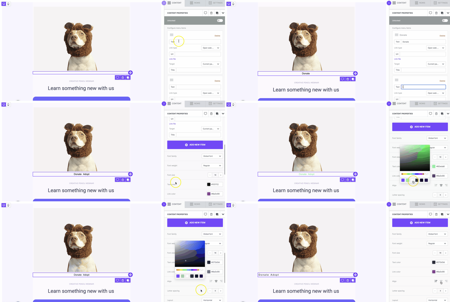
Adding a menu
Drag and drop a menu content block onto the builder stage. The empty menu block shows a placeholder image.
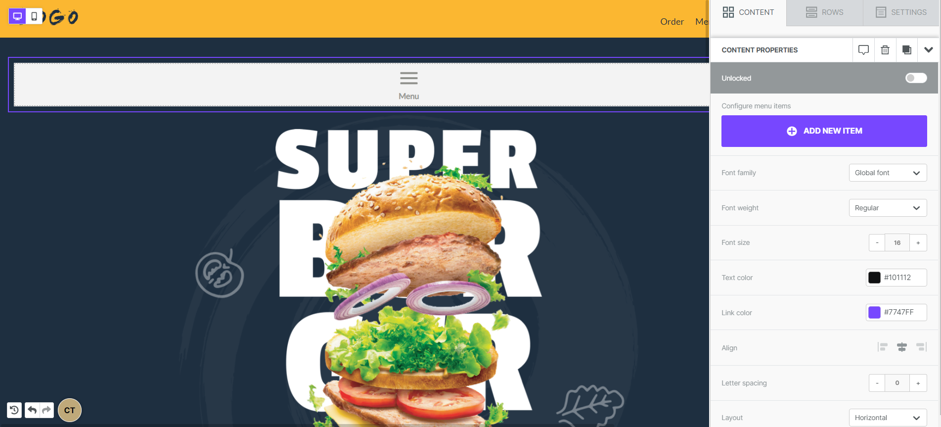
The block settings appear in the sidebar. Click Add new item to add your first menu item.
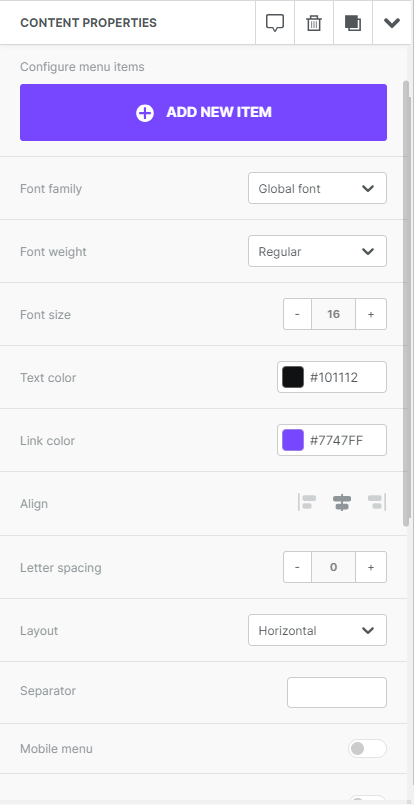
Each menu item has these fields:
- Text is the label that appears in your menu.
- Url is the link for that item.
- Title appears when you hover over the text.
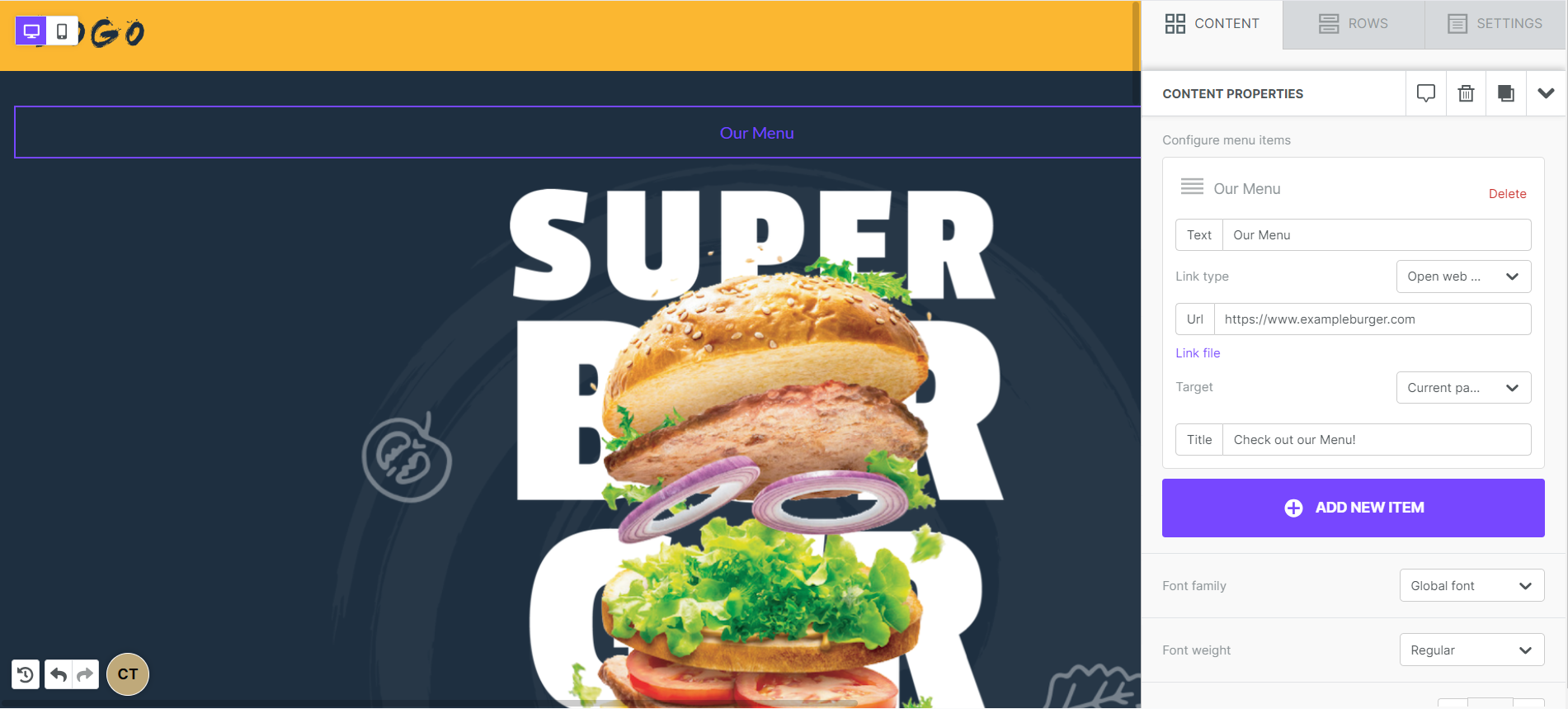
Link types include:
- Open web page
- Send email
- Make call
- Send SMS
Web page links can open in the same window or in a new tab.
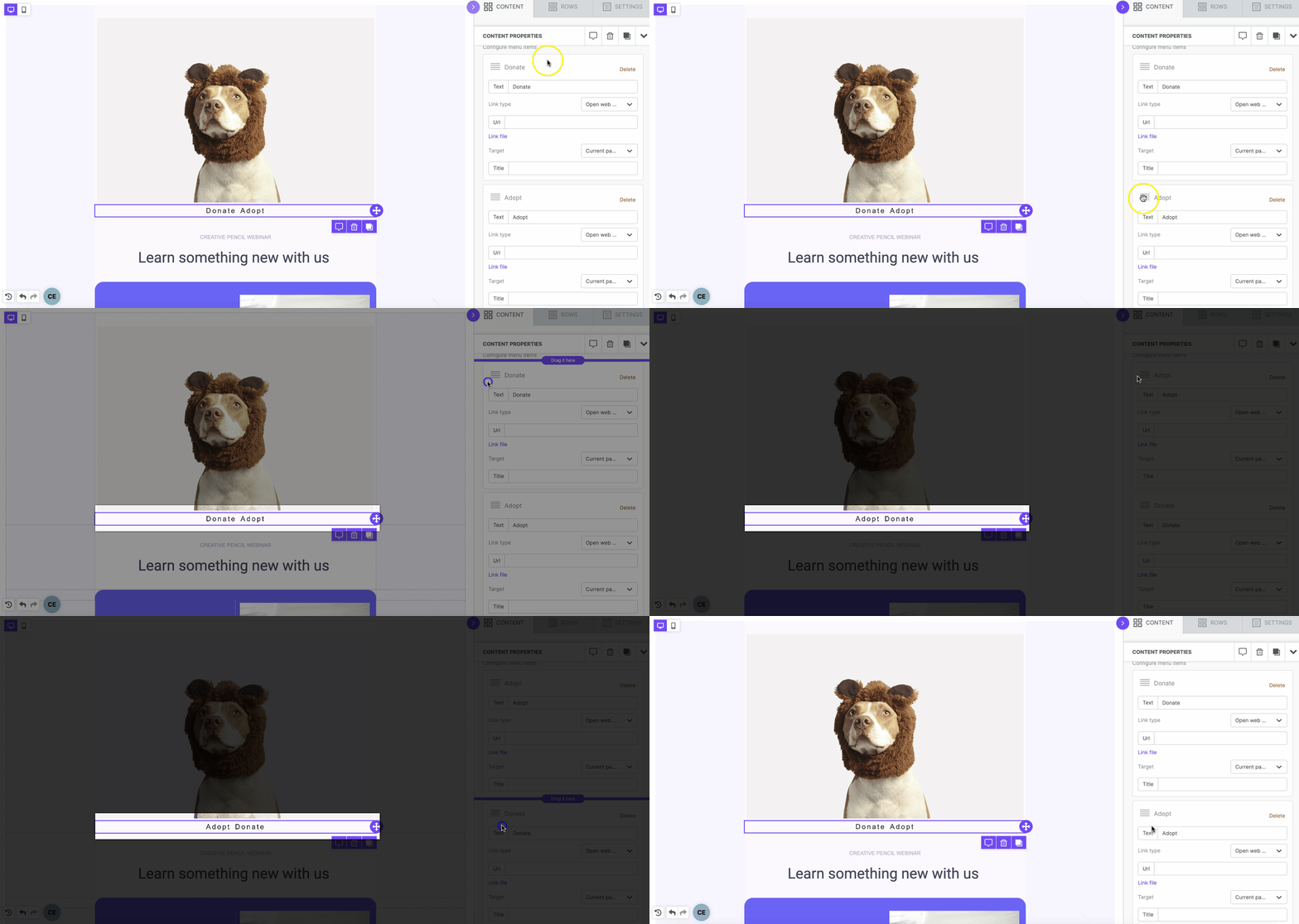
You can reorder your menu items. Drag the icon in the upper-left corner of the item settings.
Designing your menu
When your menu items are ready, use the sidebar settings to customize your menu. You can change the text styles here. You can also switch the layout between horizontal and vertical. Select your layout from the dropdown.
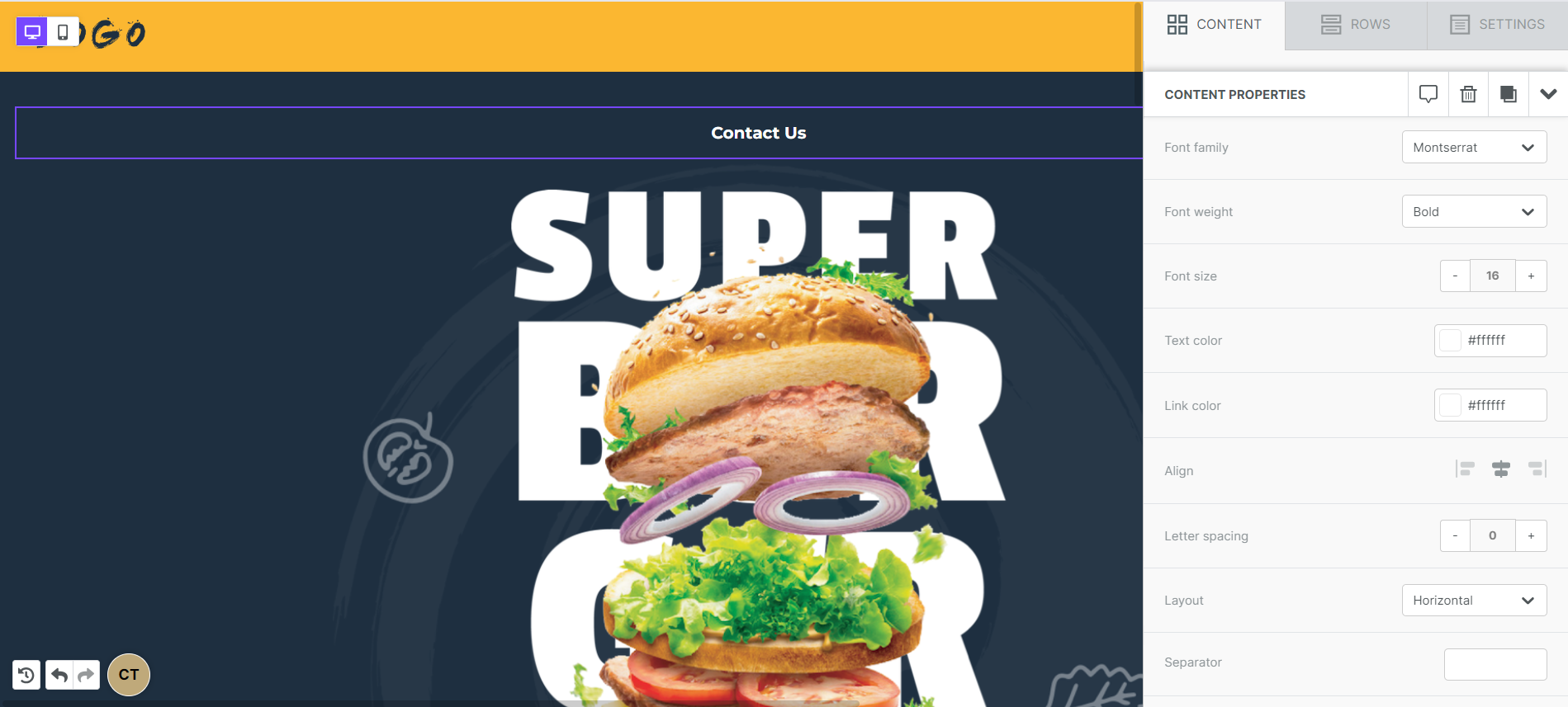
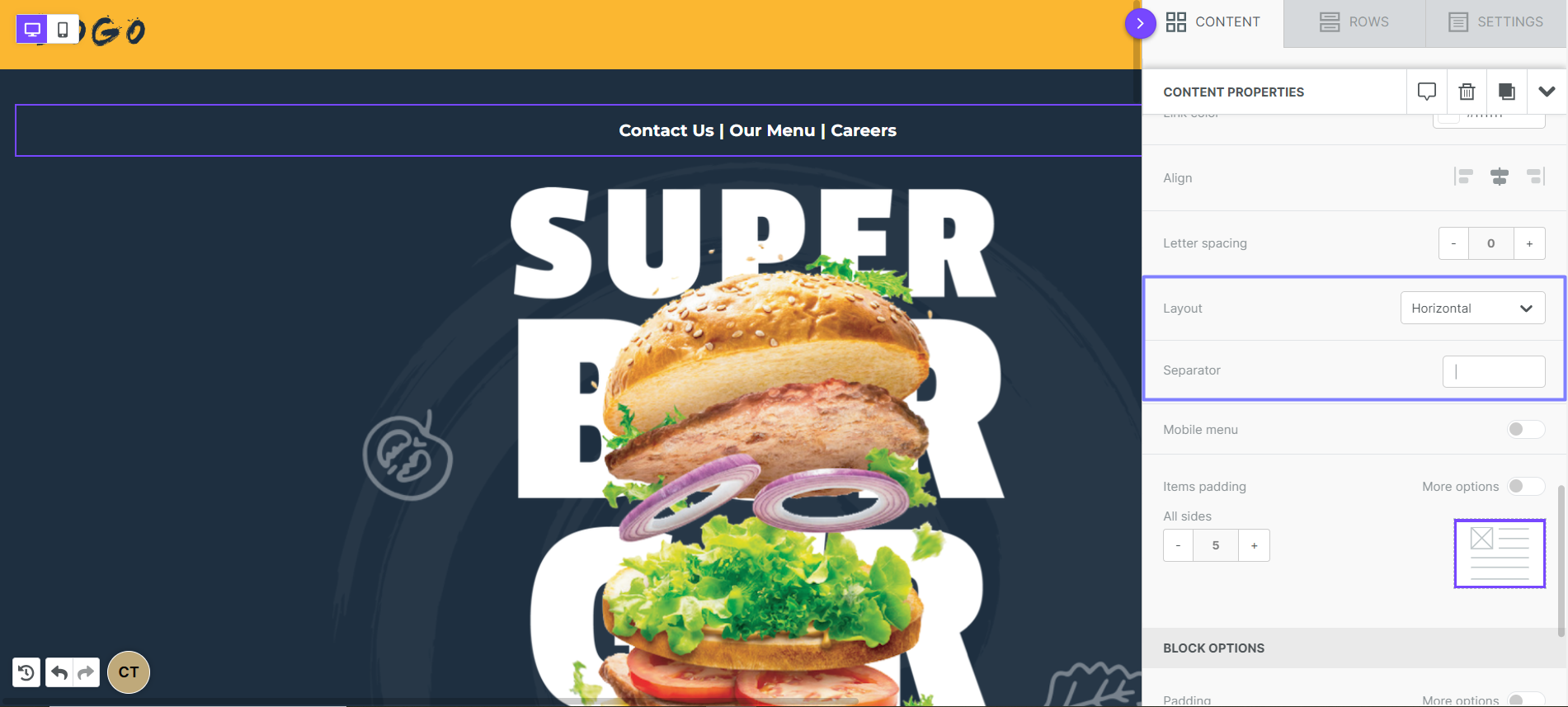
Horizontal menus can use a Separator. This is a text character that divides your menu items. The separator uses the same color as your menu text.
Use items padding to add padding around each menu item.
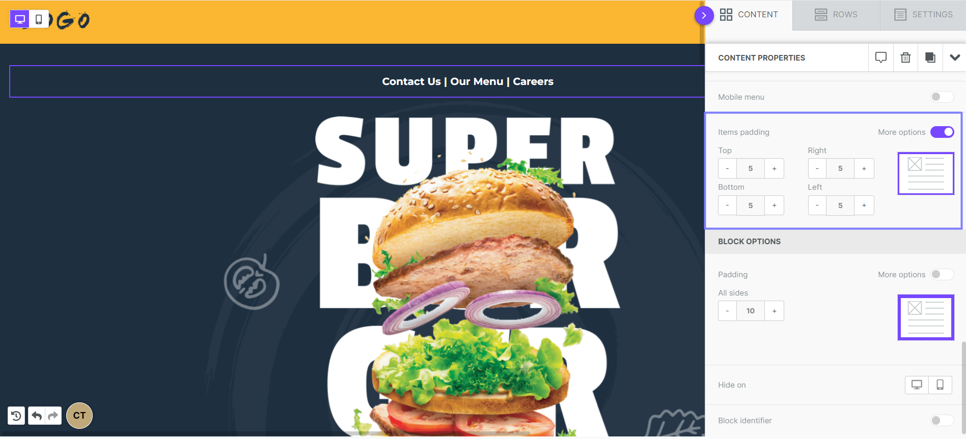
To add padding around the whole menu, use the padding settings in the block options.
Mobile menus
Mobile menus are fully supported in modern browsers. On the other hand, mobile menus work in a limited number of email clients. Check the compatibility table before you add one to an email.
The Mobile menu option creates a mobile version of your menu for you. To see mobile menus in the builder, you must use mobile design mode. With this option enabled, there are different menu versions for desktop and mobile.
Turn on the Mobile menu toggle. More settings appear under content properties.
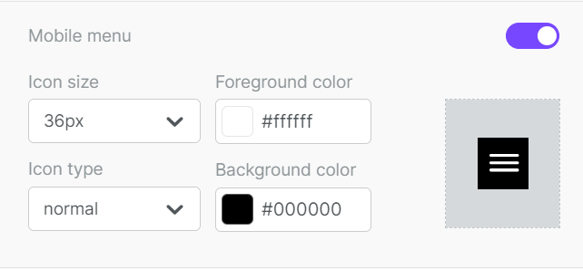
On mobile devices, an icon replaces your menu. The icon opens and closes the menu. The mobile menu always displays vertically. Separators appear only in the desktop menu.
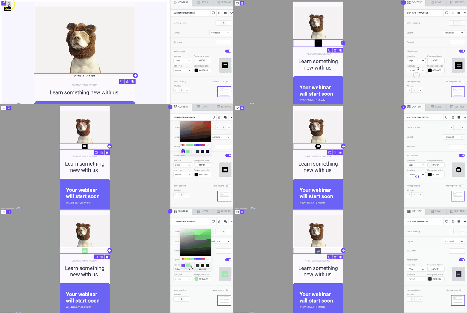
Use icon size to set the size of your menu button. Use the icon type dropdown to choose a normal (square) or rounded button.
The foreground color sets the color of the icon details. It also sets the text color in the open menu. The background color sets the icon background only. The open menu uses your content background color.
Mobile menu compatibility
| Email Client | Compatible? |
|---|---|
| Gmail iOS | No |
| Gmail Android | No |
| Outlook iOS | No |
| Outlook Android | No |
| iOS native | Yes |
| Yahoo iOS | No |
| Yahoo Android | No |
If you have any questions, feel free to contact us.
Comments
4 comments
Hello. Do you have any plans to add this feature in BEE Plugin? If so when will it be added?
Hi there! Menus are already available in BEE Plugin. You can find the appropriate documentation for this here: https://devportal.beefree.io/hc/en-us/articles/4403052216210-Adding-a-Menu
Do you have any plans to be able to create drop-down/sub-navigation menus?
Hi Darlene! Thanks for being a part of the Beefree community!
Regarding your question, we sincerely appreciate this feedback! While we don't have any plans to add drop-down or navigational menus, as mentioned in your request, I'll happily pass this along to our Product team for review and consideration! We apologize for any inconvenience this may cause in the meantime. If you find this a necessity within your page design, you can always utilize implementing Custom HTML at your own discretion and expertise.
Please sign in to leave a comment.