Using dividers and spacers

Beefree App is now RGE Studio!
The email design suite you already know and love just leveled up. We’re working hard to update our help center, but you still may see some references to the old product name.
This article applies to the Email and Pages builder in all plans.
Overview
The divider and spacer content blocks create breaks and spacing in your designs. They can look similar in a finished design. Each provides a different set of sidebar options, so choose the one that fits your needs. So what are the differences and similarities between these content blocks? Let's take a look.
Dividers
The divider content block adds a horizontal line to your design.
 To use the block without a visible line, enable the Transparent toggle.

To customize a visible line, use the Line settings in the sidebar:
- Appearance: solid, dotted, or dashed
- Line height
- Color

Use the Width setting to control how much of the column the line spans. Use the Alignment setting to position the divider within the column.
The divider content block also includes padding. It works the same as padding in other content blocks, with a maximum value of 60px per side. For more flexible vertical spacing, use the spacer content block.
Spacers
The spacer content block creates blank space in your design. The only setting in the sidebar is Height, which lets you specify the exact amount of space to add.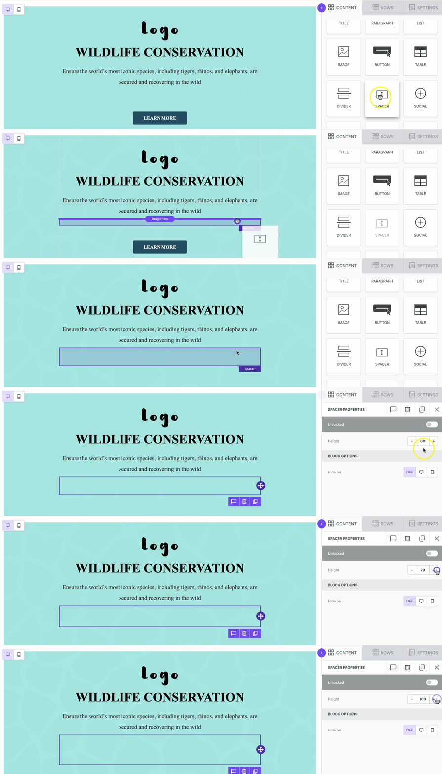
You can set the spacer to any height. Use it when you need precise control over spacing, such as when working with background images or images with varying aspect ratios.
If you have any questions, feel free to contact us.
Comments
0 comments
Please sign in to leave a comment.