Mobile design mode

Beefree App is now RGE Studio!
The email design suite you already know and love just leveled up. We’re working hard to update our help center, but you still may see some references to the old product name.
This article applies to the Email and Pages builder in all plans.
Overview
The builder has many ways to optimize your designs for mobile devices. For example, you can hide content from specific devices. You can also control how content stacks on smaller screens.
Switching between builder and preview modes requires extra steps. Mobile design mode lets you toggle between a desktop and mobile design stage without leaving the builder.
Check this video to see how many options you have to improve your design!
How it works
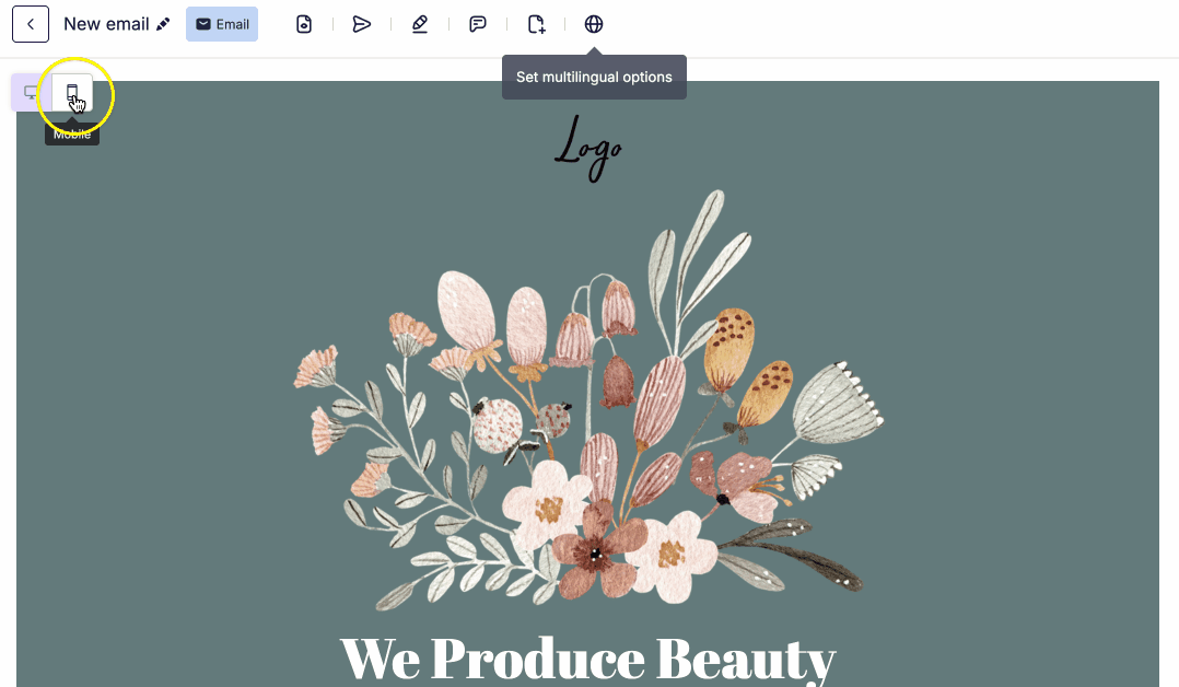
Inside the builder, two icons appear in the upper left-hand corner.
Use these icons to switch between desktop and mobile view. In desktop view, the builder works as normal. In mobile view, the content area narrows to 320px.
Mobile view gives you access to all the same features and options. Content area width is fixed in mobile view. The grey backdrop in mobile view is not part of your design.
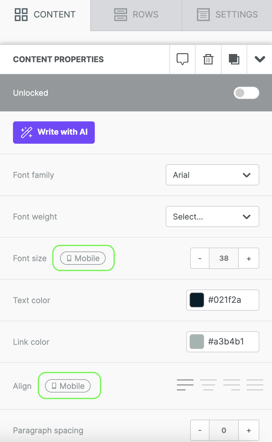
In mobile design mode, some settings apply only to the mobile version of your design. Look for the mobile indicator in the sidebar to identify these settings. The example below shows this icon next to the alignment option.
Visibility Options
A second icon appears next to the toggle when your design has hidden content. This icon looks like an eye and acts as your visibility toggle. By default, visibility is off. Hidden content stays invisible in your current design mode. Turn on visibility to see all hidden content, regardless of design mode.
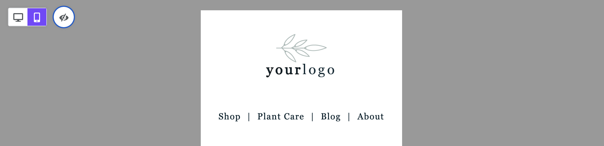
The screenshot below shows mobile design mode with visibility enabled.
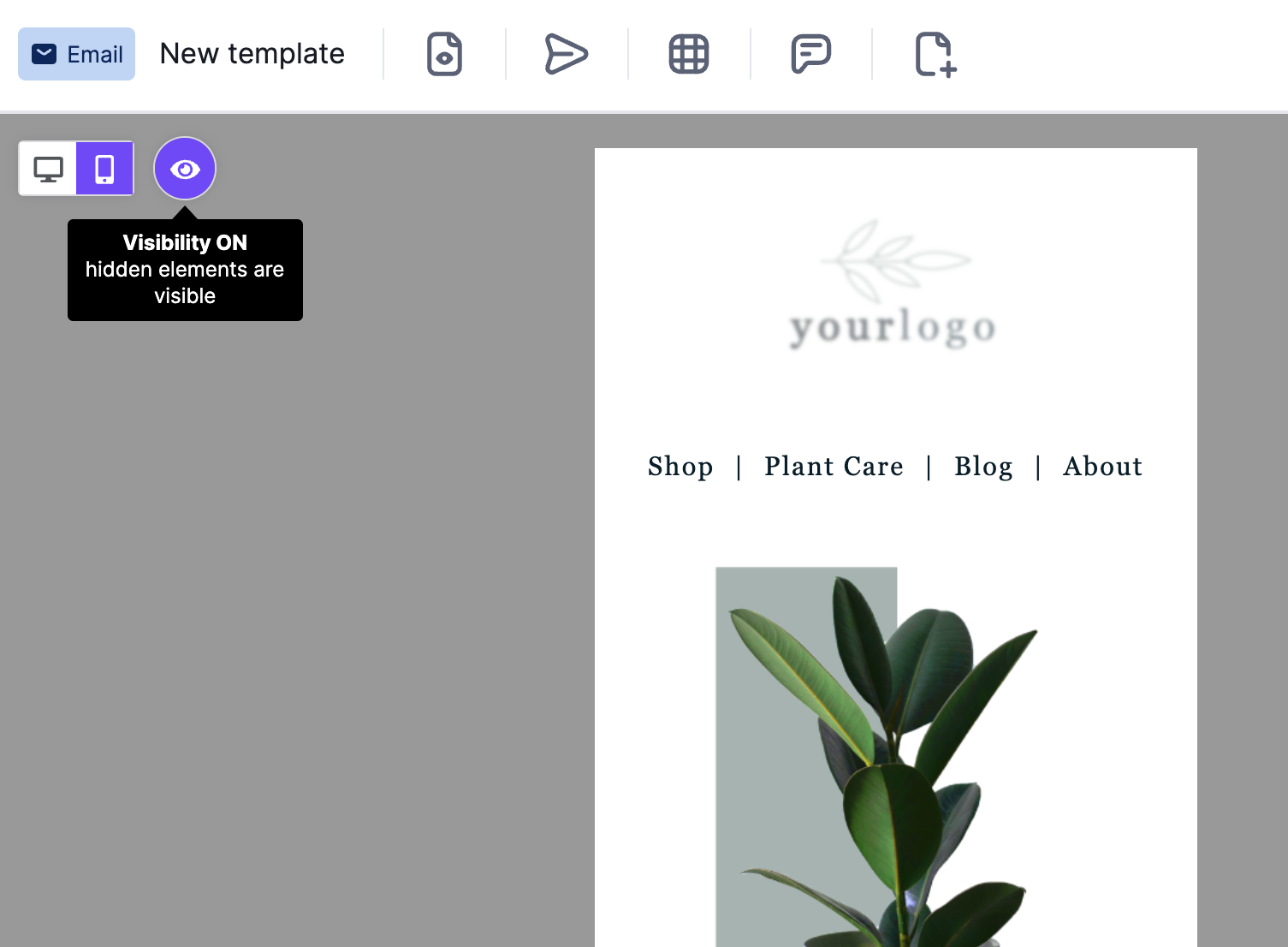
With visibility on, hidden content appears translucent on the builder stage. To use design mode as a preview, turn off visibility.
Hidden Content
Some content blocks may appear translucent or out of focus. This happens when content is hidden from the device type your design mode reflects. Hidden content appears translucent so you can identify it quickly.
For example, you might have two versions of your company logo. One is optimized for mobile, and one is for desktop. You have hidden each version from the device it is not intended for.
In either design mode, content hidden from that view appears translucent.
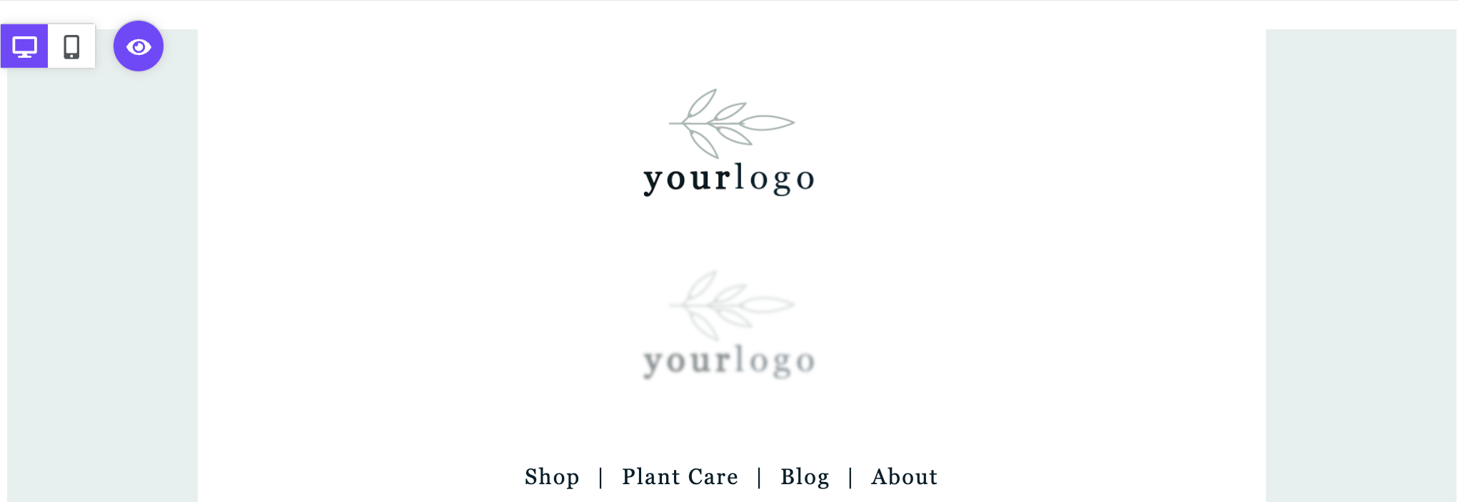
In the example above, the top logo is hidden from mobile. It displays normally in desktop mode. The bottom logo is hidden from desktop. The builder reduces its opacity so you can identify it.
The same example looks different in mobile design mode.
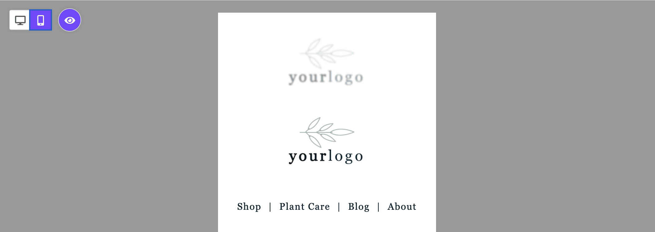
In mobile mode, the desktop-optimized content appears translucent.
When you select hidden content, you can only adjust its settings in the sidebar. For example, you cannot edit text inside a hidden content block. Switch to the design mode where that content is visible to edit it. You can change the block settings from any view.
This behavior only occurs when visibility is on. Turn off visibility to see only the content intended for your current design mode.
Designing for Mobile Devices
Mobile design mode includes mobile-only design settings. You can apply these settings to the following elements:
- Alignment
- Button width
- Padding
- Spacer height
- Text size
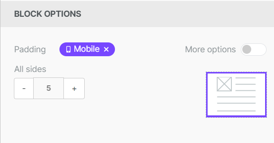
Look for the Mobile icon in the sidebar to find these settings. When no mobile-only settings are applied, the icon displays in gray. When you apply mobile-only changes, the icon turns purple. This confirms the change applies only to the mobile version of your design.
Edits to elements without the Mobile icon impact both versions of the design.
If you have any questions, feel free to contact us.
Comments
5 comments
I am editing in mobile mode and everything looks good when I send a test email. But whenn I send it my gmail drafts, the content I hid for mobile does not work
Hi Bridget,
I'm sorry to hear you're having issues with the "hide on mobile" option. I'm creating a support ticket on your behalf to investigate this further. Please keep an eye out for an email from our team!
I am having the same issue as Bridget, can someone help me with that too?
Hello Denys!
Can you please confirm that you're creating a design with Beefree (where you're using the hide on mobile feature to hide certain elements), and you're exporting the email to Gmail using our connector - and then when sending the email from Gmail and receiving it on a mobile, you're still seeing the desktop version of the design and not the version intended for mobile (with hidden design elements). Is that correctly understood?
How do I completely remove designing with Mobile Because Its irrelevant to an email Im designing. Thank you.
Please sign in to leave a comment.