Mobile Optimization Options

Beefree App is now RGE Studio!
The email design suite you already know and love just leveled up. We’re working hard to update our help center, but you still may see some references to the old product name.
This article applies to the Email and Pages builder in all plans.
Overview
Content in an email is often organized in multiple columns. Columns can become narrow when viewed on a mobile device. This can lead to a poor reading experience. To prevent this, the builder stacks content vertically on mobile devices. This makes your design easy to scroll through. It also removes the need to zoom in to read the email.
The default mobile settings may not fit every design. You can use several features to change how your design behaves on mobile. This article covers each of these options.
Desktop vs Mobile Preview
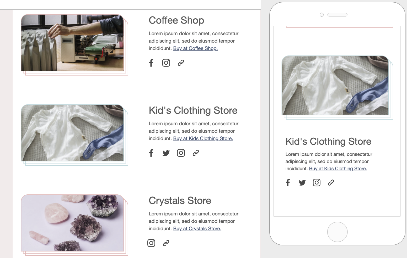
Vertical stacking is supported by the most popular mobile email clients. In some cases, the desktop version will be displayed. This happens when a client lacks support for standard CSS. For email client compatibility, see the email client support section.
One Size Doesn't Fit All
Vertical stacking works well in most designs, but not all. A navigation bar row is a common exception. Stacking this content could create excessive empty space in the design. It could also hide key elements. It might also draw too much attention to one element.
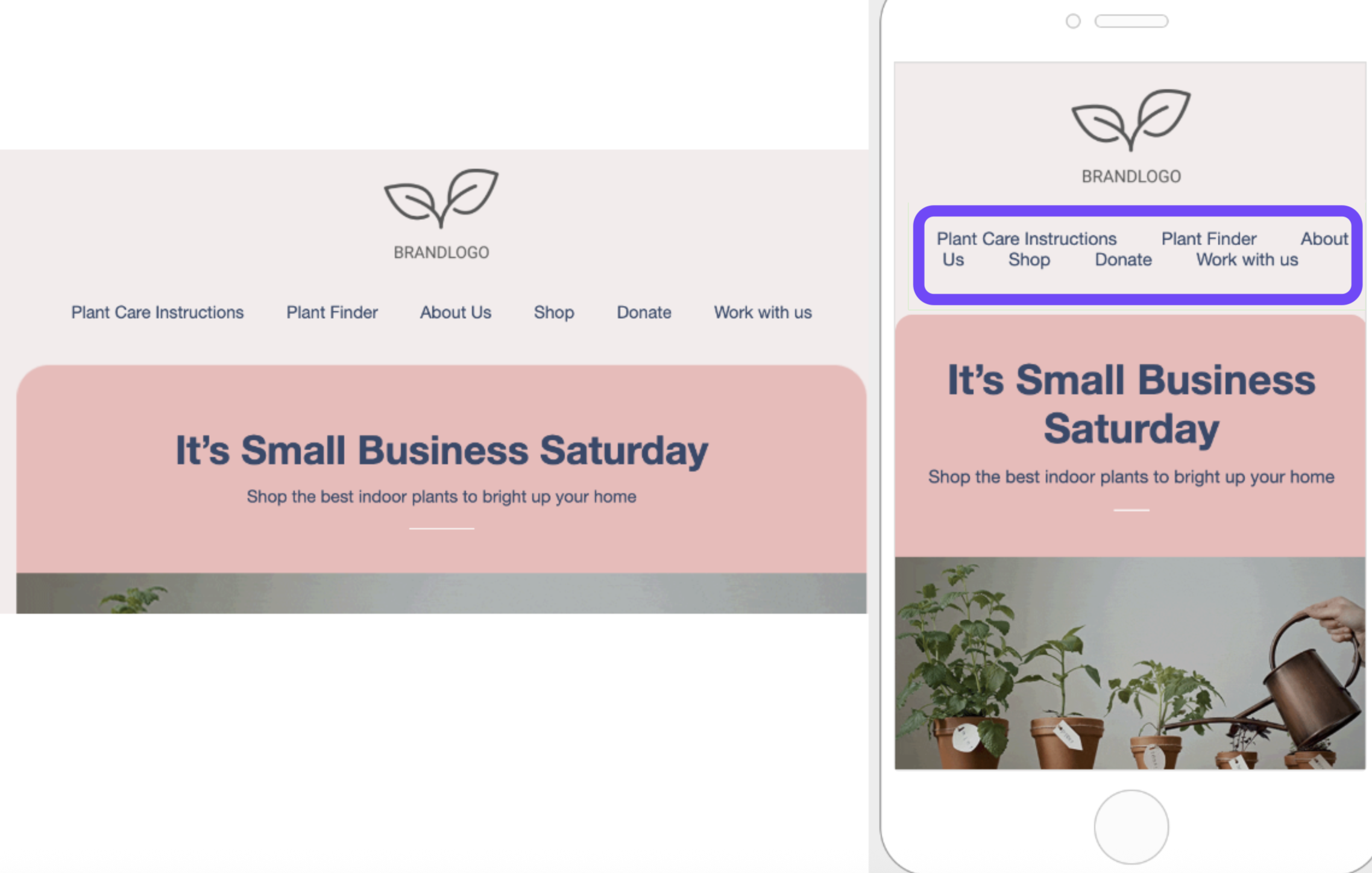
Do not stack on mobile
The Do not stack on mobile row setting overrides the default stacking behavior. You'll find this option in the right panel as a row property. It's toggled off by default.
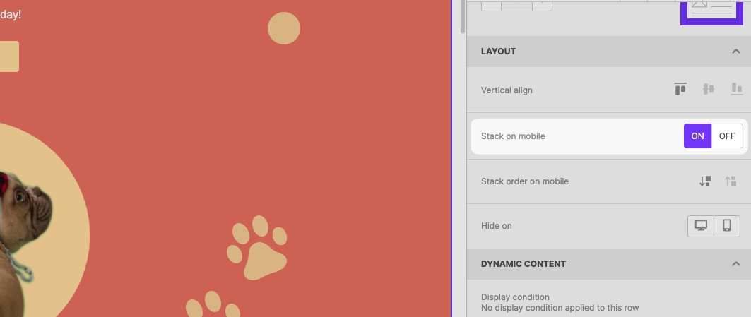
Use this setting carefully. A vertical layout on mobile works best for most designs. The choice of when to use this option is yours.
Stack order on mobile
In some cases, a reversed stacking order works better on mobile. Use Stack order on mobile to set the order for your design.
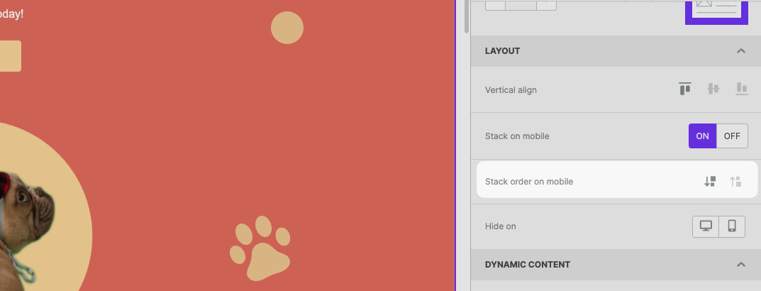
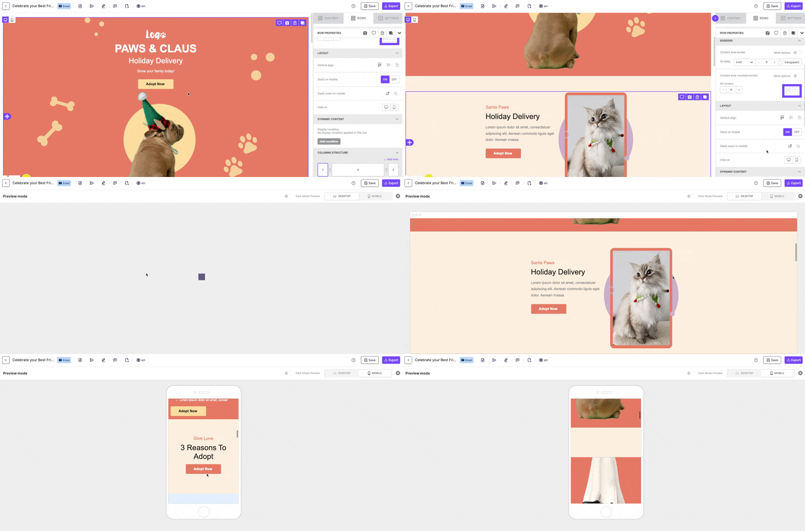
Here is an example from an RGE Studio template:
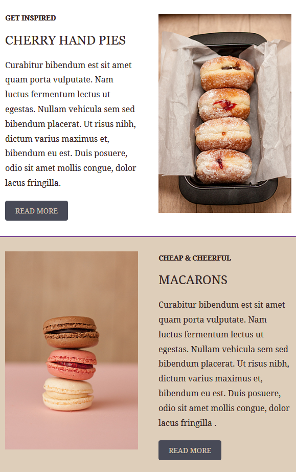
The same template also has a section where images are aligned on the right.
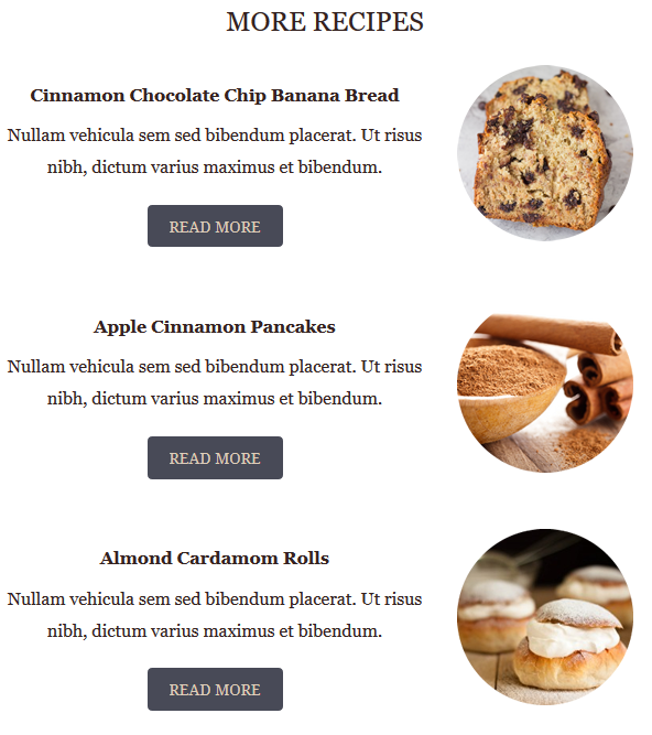
This is how these two sections render on mobile by default:
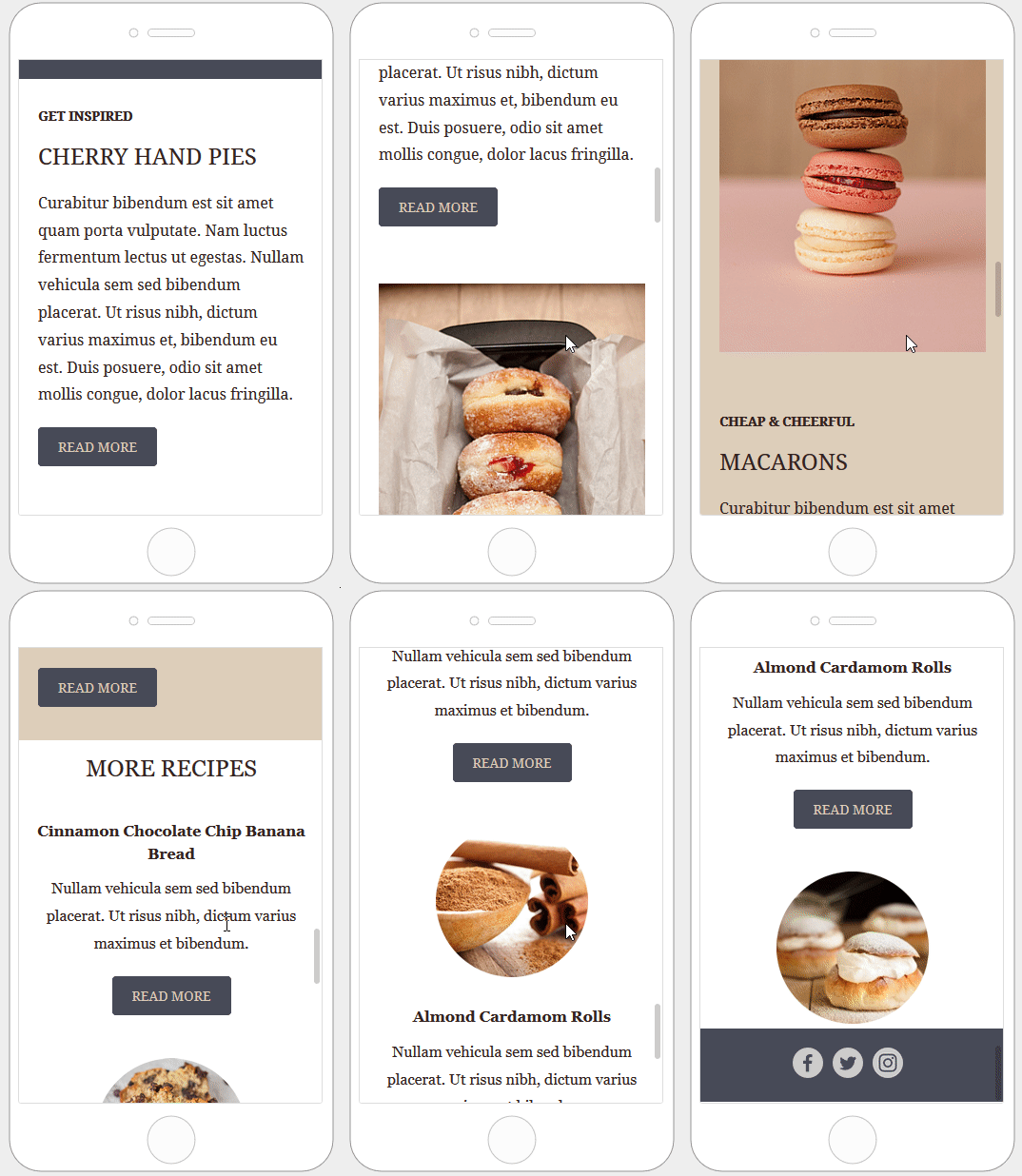
Here is how the email layout renders when columns are stacked in reverse order:
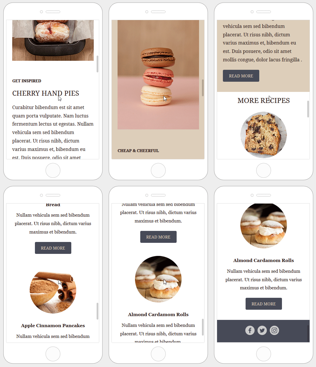
This option supports designs with up to 3 columns.
Hide on desktop/mobile
The Hide on feature works at both the content and row levels. You can hide individual content blocks or entire rows from a specific device type.
Hiding Content
All content blocks in the builder include a Hide on setting in the property panel. To find it, scroll down to the Block Options section.
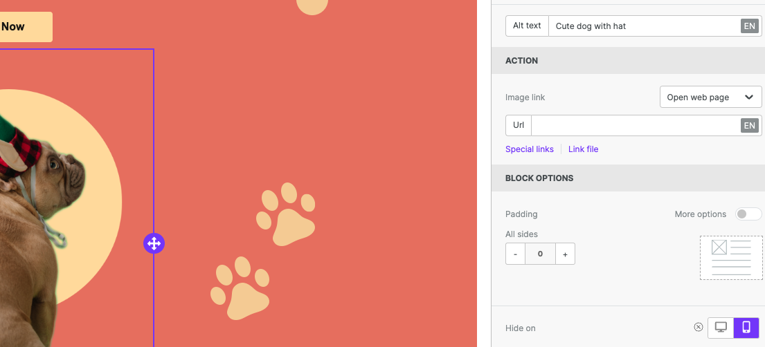
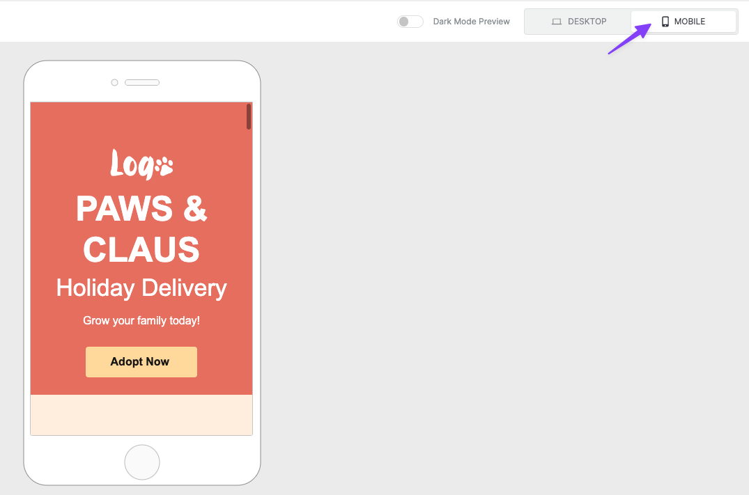
You can check the result by going into the Preview and selecting the Mobile view. You can also preview by toggling between desktop and mobile design mode. Make sure to keep visibility turned off. Content blocks with Hide on turned on are hidden in that view.
Hiding Rows
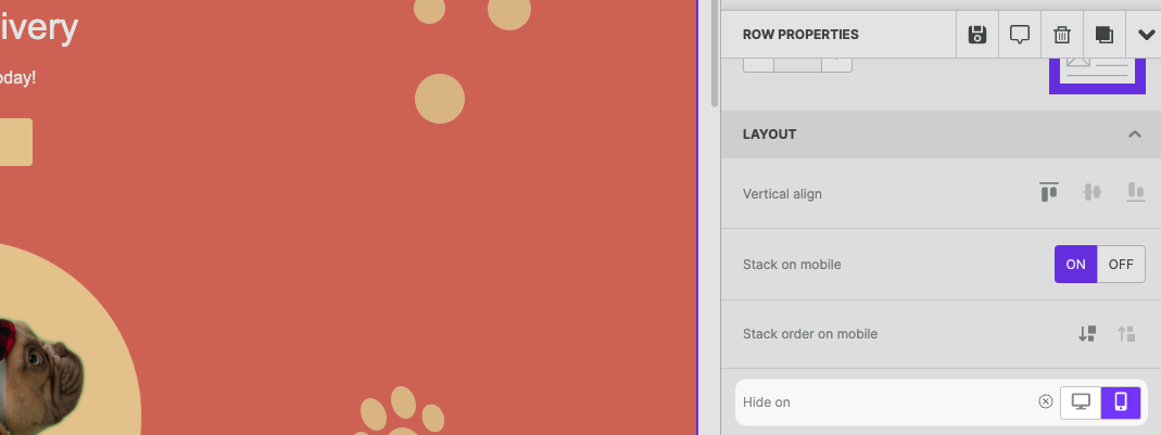
To hide a larger portion of your design, hide an entire row instead. The workflow is almost the same as hiding a content block.
First, select the row you want to hide. You'll find this option in the Row Properties section of the sidebar.
Mobile Styles
Sometimes you need more granular control over mobile optimization. For example, you might want to modify a single element instead of the entire block. A common use case is setting a different text size for mobile devices.
In mobile design mode, you can apply certain mobile styles. These styles apply only to the mobile version of your design. You can customize mobile settings for the following elements:
- Alignment
- Padding
- Text Size
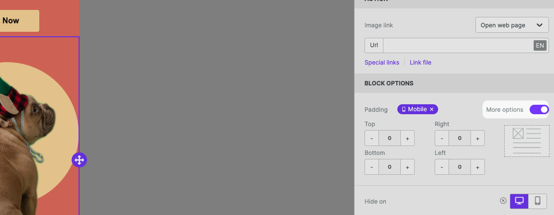
Elements with available mobile styles will populate with an icon in the sidebar. You must be in mobile design mode to see these options.
For more on mobile-optimized content, see Mobile design mode.
If you have any questions, feel free to contact us.
Comments
11 comments
Thanks! This is a great addition.
Thanks—our team's been dying for this!
Is there a way to have an image I have used on the right side in a row to appear before the left side item when viewed on mobile?
i.e. A B
to:
B
A
^Our team would also love a feature to assign the order in which multi-column structures stack on mobile.
^^^^ I'd like information on this too please Beepro!
Hi ALL, stack order is not available yet, but it's on our list (it's a big list, but this one has a lot of votes 😉).
Just waiting to finish some important developments to start adding it.
Hi!
I have a solution, but a little hack in the exported html is required to work.
So, in the editor you have to make both of version (A B and B A) and after exporting newsletter you have to add classes or ids to the containers of these versions in the html file(i.e .hideOnMobile and .hideOnDesktop), then the css below into tags:
@media (max-width: 720px) {
.hideOnMobile{
display: none;
}
}
@media (min-width: 725px) {
.hideOnDesktop{
display: none;
}
}
It worked for me.
Hi,
Is there any way I can set "Do not stack on mobile" enable by default?
Hi Nick, you can create a template with the toggle enabled. At the moment, is not possible to fix it by default.
Hi all, I'm new to BeePro and HTML emails so apologies if this is a silly question. I'm trying to figure out how to set up my email so that in desktop it uses say 16px but on mobile it is 12px. When I toggle between the desktop and mobile preview modes, whatever changes I make to font style seem to carry over back to the other preview mode. Any help is much appreciated.
Thank you.
Hi Sean! Thanks for reaching out, and welcome to the Bee Pro community! We're so happy to have you here!
To clarify, design mode allows you to see what the design looks like on a mobile device in real-time, but it doesn't allow you to set mobile styles. The only way to modify just the mobile version of the design is by using the features described in this article, so you would need to just duplicate some content and use the hide on feature in order to achieve the design you're looking for. I hope that this helps, and if you require further troubleshooting feel free to let us know!
Please sign in to leave a comment.