Rows with 5 Columns

Beefree App is now RGE Studio!
The email design suite you already know and love just leveled up. We’re working hard to update our help center, but you still may see some references to the old product name.
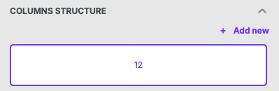
We built the Beefree builder on a structure that allows you to reuse content. It also enables us to generate mobile-optimized HTML upon export. Each row in a design can have a maximum of 12 columns. When viewing the Column Structure for a row, each column is expressed has a number assigned ("column unit"). The total must always equal twelve and widths are always expressed via whole numbers.
 |
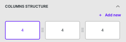 |
Above, you can see examples of this in a single-column row or a 3 column row. For more examples, please refer to Column management.
The structure allows for design flexibility, especially for rows between 1 and 4 columns. Why? If you divide 12 by either 1, 2, 3, or 4, the result is always a whole number. If you divide 12 by 5, however, you get a decimal. As a result, you might think it's not possible to create an equal-width 5-column row.
Not to worry! With granular padding and creative problem-solving, you can create a row like this. We're happy to show you how.
Steps
Follow the steps below, or watch our video tutorial:
-
Choose a compatible Content Area Width: Pick a content area width that is divisible by both 12 and 5. For this example, we'll use 600. Note that this content area width is required.

-
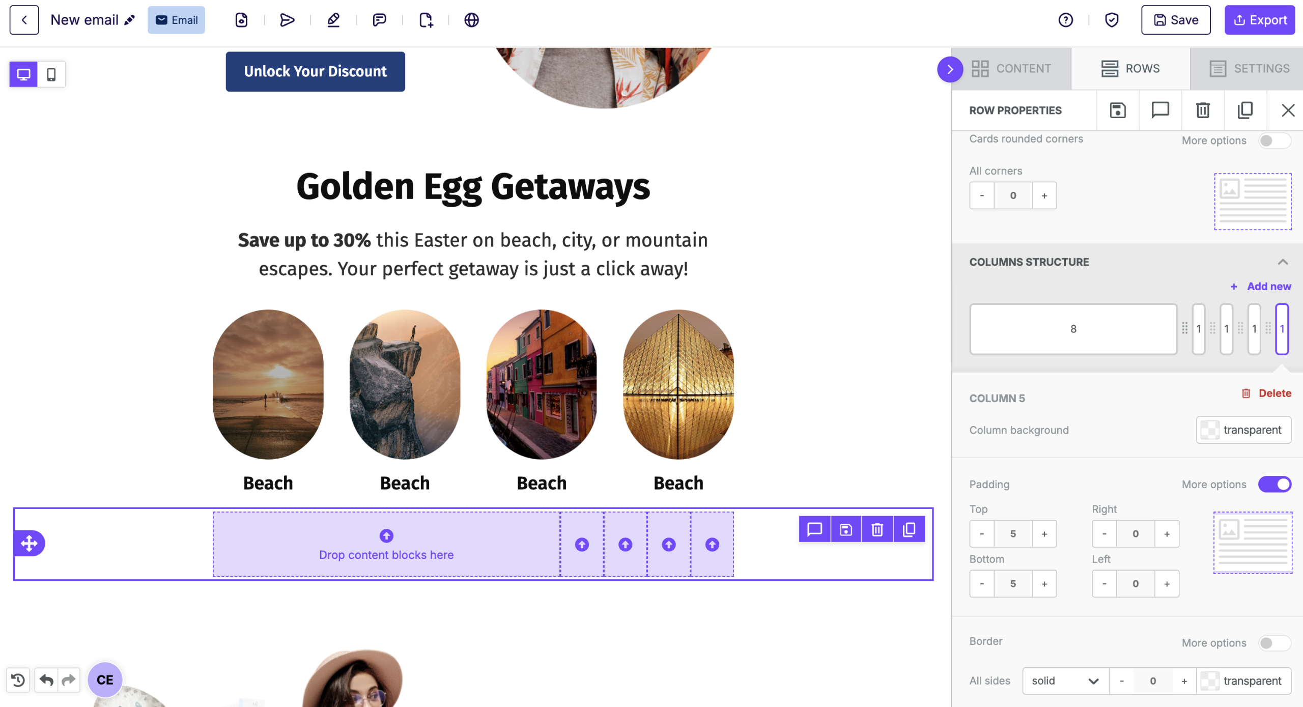
Put 5 columns in your row: With your row selected, scroll down in the sidebar to Columns Structure. Click + Add New until you have 5 total columns.
-
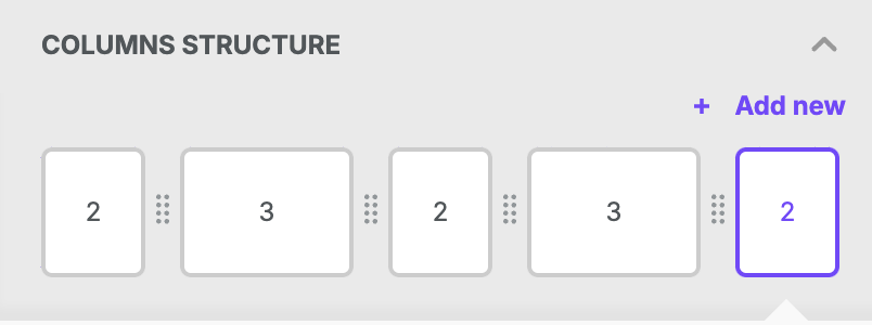
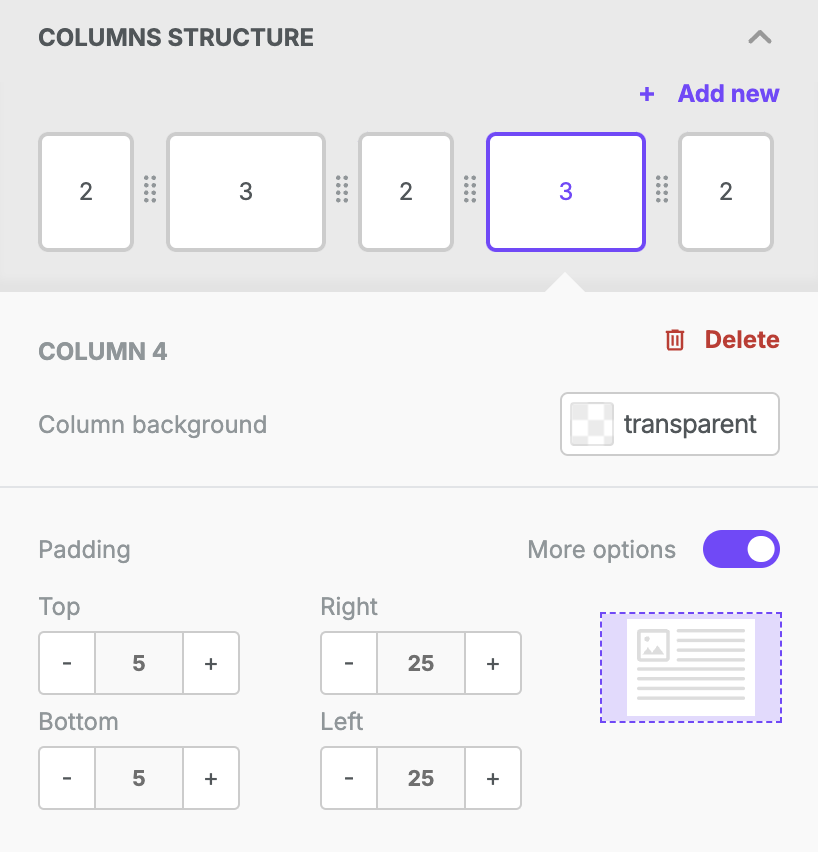
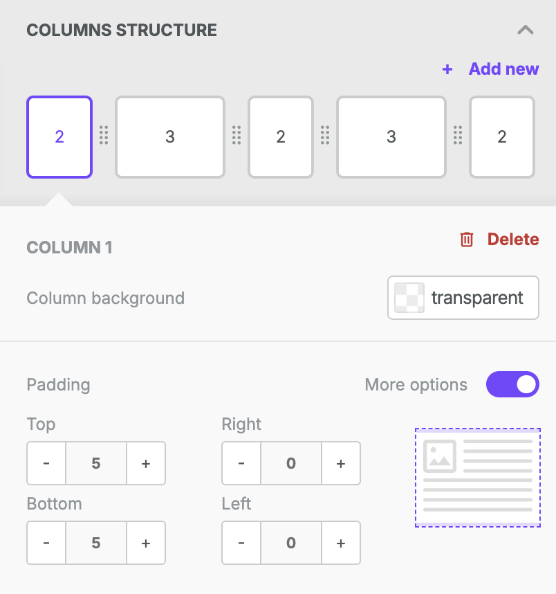
Restructure the columns: Click and drag the columns until you have a structure of 2-3-2-3-2.
-
Adjust padding for wider rows: Modify the padding on the columns with a width of 3 only. Apply 25px of padding on both the right and left sides.
-
Adjust padding for smaller rows: Modify the padding on the columns with a width of 2 only. Apply 0 padding on both the right and left sides.
- Voila! You have a row with 5 equal-width columns on the builder stage.

Now you are free to drag and drop content blocks anywhere within your new row! Note that each content block has padding settings as well. This could make the column widths appear uneven.
How We Did it
You can adapt this workflow for different content area widths or 7 (or maybe more) columns. Below we show our math step by step, using the tutorial as our example calculation.
Step 1: Calculating the pixel value of one column
Start by calculating the pixel width of a column that is 1 unit wide:
Content area width/maximum number of columns
600/12=50
In order to proceed, the total must be a whole number.
Step 2: Finding the ideal column width
Divide the content width area by the desired number of columns to get the target width per column:
Content area width/desired number of columns
600/5=120
Step 3: Round down to the nearest possible column width
Take the number that you identified in step 2 and round down to one of the possible column sizes. In this example, we'll round down to 100.
This calculation tells us that, in order to create a row with 5 columns, each column can have a width of at least 2.
Step 4: Adjust the column structure
The ideal column width from step 3 would only result in 10 total column units. To make up for this, we'll increase the width of a couple of the columns in our row by just one unit. In this example, the additional widths are applied to alternating columns.
Now the row is compatible with Beefree - but the row has inconsistent column widths.
Step 5: Calculate the width used so far
We need to look at the amount of space that would be taken up by the row with all rounded-down widths:
Rounded down pixel width from step 3 * desired number of columns
100*5=500
Step 6: Calculate the remaining space
Content area width - total from step 5
600-500=100
Step 7: Distribute Padding to balance column widths
Our row has two wider columns (with widths of 3). To balance the design, we need to apply padding to the right and left sides of both of these columns.
To evenly distribute the remaining space:
Remaining content area from step 6 / ([# of wider columns in the row] * 2)
100 / (2*2)
100 / (4) = 25
Apply this number to the right-padding and left-padding on the wider columns of your row. The smaller columns should always have the padding set to zero.
Note: This works because the padding forces each column to have an equal area to place content blocks. The alternating column widths allow identical distribution of the spacing between columns.
For rows with wider columns next to each other, the padding values need to be distributed differently on each side to ensure proper spacing. The amount of padding per width required per column remains the same.
Comments
0 comments
Please sign in to leave a comment.