Advanced Style Kit for Workspace Styles

Beefree App is now RGE Studio!
The email design suite you already know and love just leveled up. We’re working hard to update our help center, but you still may see some references to the old product name.
This article applies to the Business and Enterprise plans.
Overview
All paid RGE Studio plans have access to Custom Workspace Styles. The Advanced Style Kit adds style defaults for more content types.
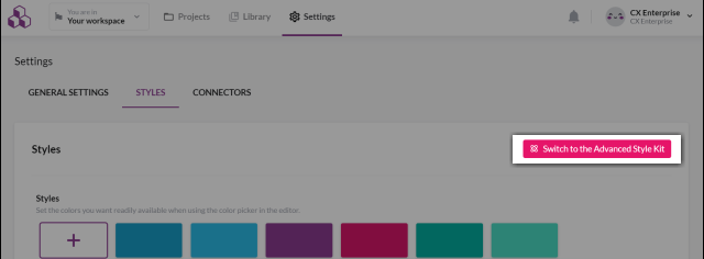
To open the Advanced Style Kit, click the Advanced Style Kit button. Find it in the upper right corner of your Workspace Styles settings.
Getting started
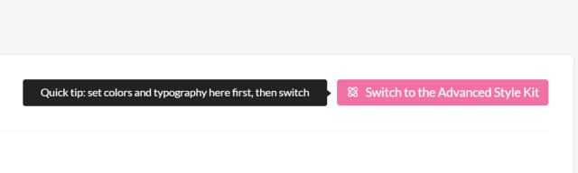
To use the Advanced Style Kit, you need to set some basic workspace styles first. If you haven't done this yet, the button is inactive. Hovering over it shows this message: "Define the color palette and fonts first."
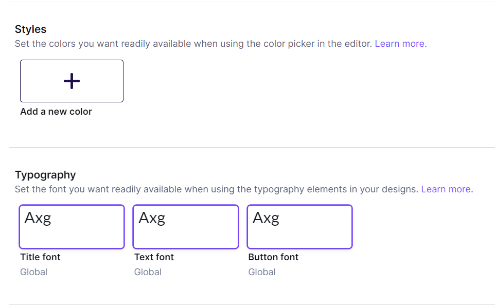
Set your color palette and typography to meet this requirement. Other workspace style settings are optional.
Once you've set your colors and typography, click Advanced Style Kit to get started.
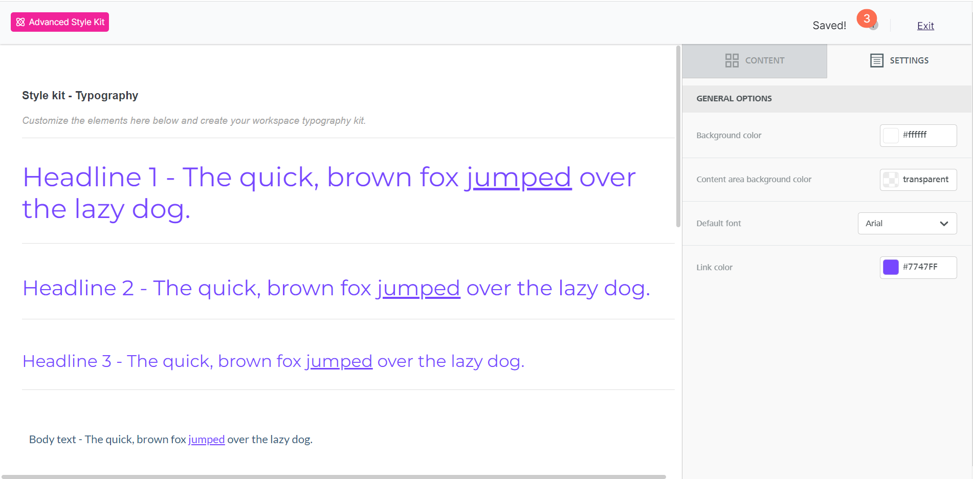
The Advanced Style Kit opens in a dedicated version of the RGE Studio builder. The upper left of the screen shows you're in the Advanced Style Kit. This version is designed for style settings. It is not drag-and-drop, and some stage elements are not interactive.
The Advanced Style Kit sidebar has two tabs:
- Content
- Settings
The Advanced Style Kit uses autosave instead of co-editing. To return to your workspace style settings, click Exit in the upper right corner. Your style updates save automatically.
Some settings in the Advanced Style Kit also appear in your Workspace Styles. Editing one here means you must manage it through the Advanced Style Kit going forward.
Settings
When you open the Advanced Style Kit, it opens on the Settings tab. These settings correspond to the design settings in the email and page builder.
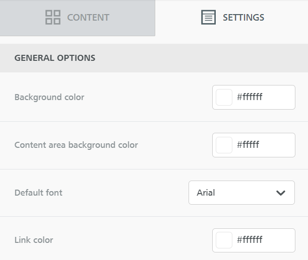
Use these settings to customize your workspace styles. To set content area width, go to your Workspace Styles settings page.
Use the Advanced Style Kit to set custom styles for:
- Background color
- Content area background color
- Default font
- Link color
You can preview these settings on the builder stage. These settings apply only when you select Start from Scratch for a new design.
Content
To open the Content tab, select a content block from the builder stage. The sidebar shows familiar options from the email and page builder. Some of these options also appear in your primary workspace style settings. Others are unique to the Advanced Style Kit.
The content blocks are organized into two sections.
Typography
This section covers the Titles and Paragraph content blocks. It gives you more control over text styles than the main workspace styles page.
Titles
The title content block covers H1, H2, and H3. There are three separate title content blocks in the Advanced Style Kit. Each corresponds to a heading style. Check the placeholder text on the builder stage to see which heading you selected.
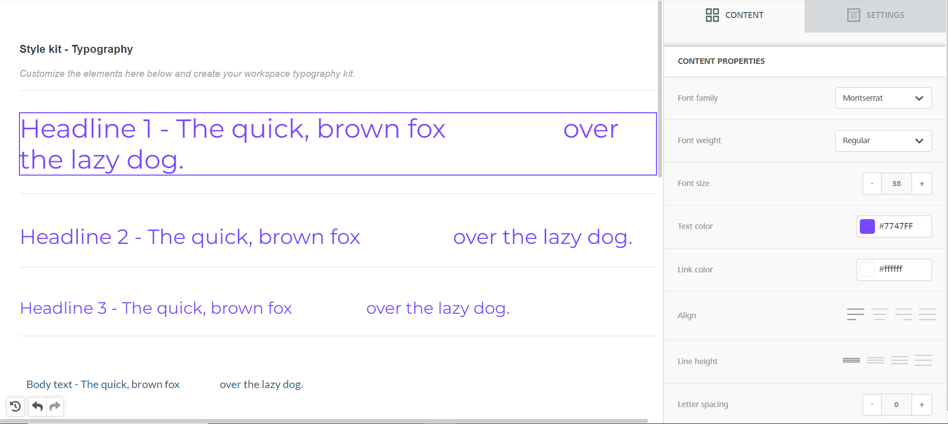
You can set these custom styles for each heading type:
- Font family
- Font weight
- Font size
- Text color
- Link color
- Alignment
- Line height
- Letter spacing
- Text direction
Paragraphs
Set paragraph block styles in the content labeled Body text.
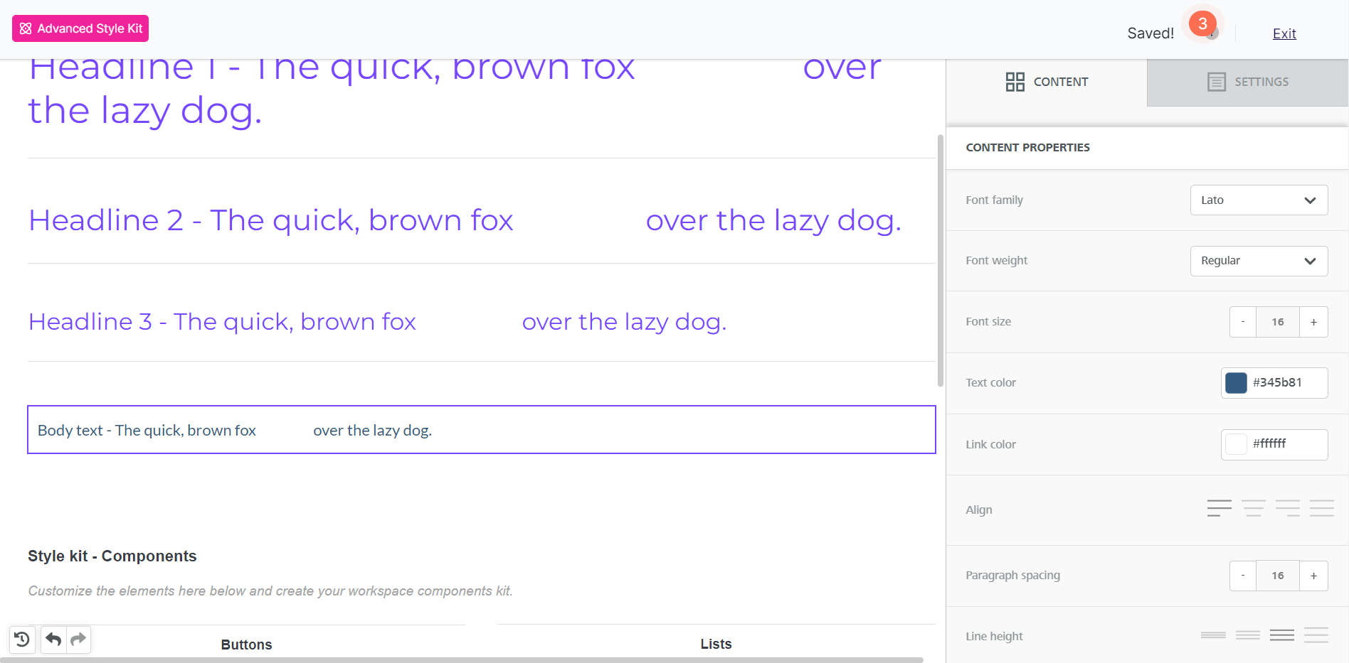
Paragraph blocks have the same style options as title blocks. They also include these additional settings:
- Paragraph spacing
- Content block padding
Components
The Components section covers several content blocks. Some are only available in the Advanced Style Kit. Others extend what you can set in the primary workspace styles settings.
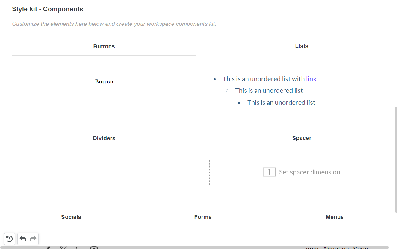
Buttons
The Advanced Style Kit includes more button customization options than the primary workspace styles settings. You can also set these additional button styles:
- Button width
- Font weight
- Alignment
- Line height
- Letter spacing
- Text direction
- Border radius
- Content padding (applies to the text within the button)
- Button borders
- Content block padding
Lists
The list content block shares many style settings with the Typography section. These settings apply only to the list block:
- List type (ordered or unordered)
- List style type
- List items spacing
- List items indent
Dividers
Divider styles are only available in the Advanced Style Kit. You can customize:
- Transparent divider toggle
- Line settings (if transparency is disabled)
- Width
- Alignment
- Content block padding
Spacers
Spacer styles are also unique to the Advanced Style Kit. Spacers have few options. You can set:
- Height
- Hide on mobile/desktop
Tables
Table styles are also unique to the Advanced Style Kit. You can set these table styles:
-
Layout
- Border
- Background color
- Striped rows
-
Header
- Header row
- Background color
- Font weight
- Font size
- Text color
- Align
-
Content
- Font family
- Font weight
- Font size
- Text color
- Link color
- Align
- Line height
- Letter spacing
- Text direction
- Content block padding
Icons
Use the Advanced Style Kit to set text styles for the icon content block.
Socials
Some social settings are available on the Custom Workspace Styles page. The Advanced Style Kit adds these additional options:
- Uploading custom social icons
- Alignment
- Padding
Forms
Form styles are only available in the Advanced Style Kit. The form content block is only available in the Pages builder.
You can manage form fields only when designing a page. All other form settings are available here as custom styles. This includes:
- Width
- Alignment
- Layout
- Font family
- Font weight
- Font size
- Label options*
- Field options*
- Button options*
- Content block padding
*These options include additional settings for text, colors, alignment, borders, and padding.
Menus
Menu styles are also unique to the Advanced Style Kit. Many menu options match those in the Typography section. Menus also have these unique options:
- Layout
- Separators
- Mobile menu toggle
- Items padding
- Content block padding
If you have any questions, feel free to contact us.
Comments
0 comments
Please sign in to leave a comment.